Your training day in one view
Recovery, the planned workout, the recorded activity, time in zones, the change in CTL, ATL and TSB, plus your habits and weight, all on a single page. Built so you can answer the one question that matters at the end of the day: what does today tell me, and what should I do tomorrow.
One page instead of three apps
Most riders and runners finish a session buried in numbers. Power, pace, heart rate, time in zone, HRV, sleep, CTL, ATL, TSB, efficiency factor, decoupling. The data exists, usually scattered across two or three apps, and stitching it together takes long enough that you stop looking.
The LeCoach day view collapses that into one place. The morning’s recovery sets the context. The scheduled session and the recorded activity sit next to each other with an honest execution score. Heart-rate and power zones show where you actually spent the time. The training-status impact card shows what the session did to your fitness, fatigue and form. The coach’s note ties it together in plain English, with your habits and weight at hand. It works for cycling and running, the same way.
Three questions every training day has to answer
Every card on the day view falls into one of these three buckets. That is the design.
How recovered are you today?
How did the session actually go?
What did it do to your training status?
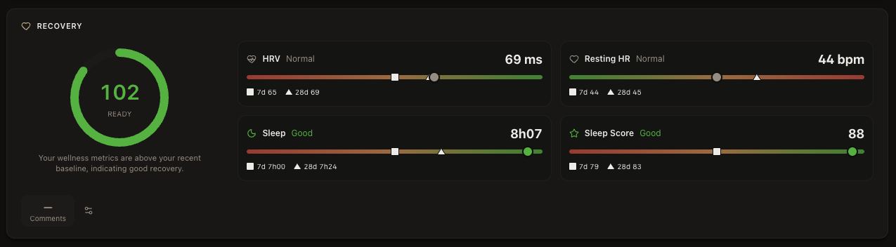
Recovery: HRV, resting heart rate and sleep
A good coach does not open with "how was the ride." The first question is what shape you were in before you clipped in. Recovery sets the context for everything that follows. The same workout can be a quiet win on a tired day or a wasted opportunity on a fresh one, and you only know which once you know where you stood that morning.
The recovery card on the day view shows a single score with a tier (ready, possible impact, attention needed) plus the four signals behind it: HRV, resting heart rate, sleep duration and sleep score. Each metric is shown against your own 7-day and 28-day baselines, so a 65 ms HRV reading is interpreted relative to your normal, not a population average. See also HRV for cyclists and recovery and fatigue.
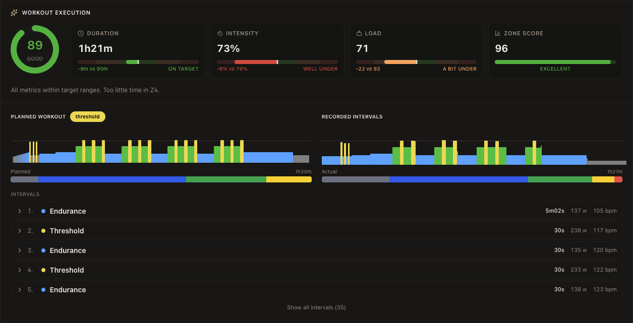
Workout execution: planned vs recorded
When the session was on the plan, the day view scores how you actually executed it. Four numbers, each comparing the recorded activity to the scheduled workout: duration, intensity, training load and a zone score. Each metric carries a band, on target, a bit under or over, or well under or over, so a session that was nine minutes short but otherwise on target reads as "on target" rather than as a failure.
Underneath the four scores sit two interval charts side by side: the planned shape and the recorded shape, with a continuous zone bar under each so you can see the structure at a glance. Below that, every interval is listed with its actual time, average power and average heart rate, so you can drill into any specific block of the workout.
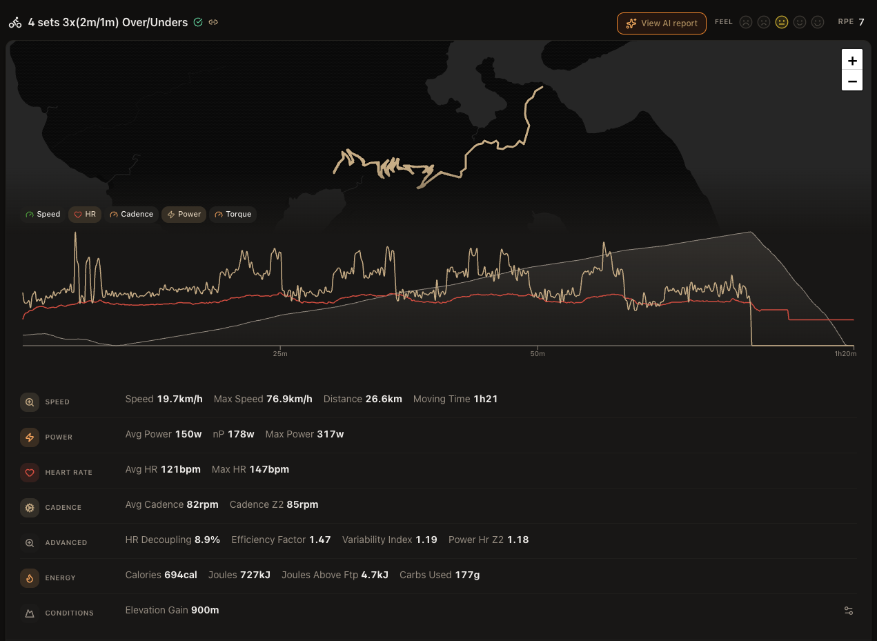
Activity stats, organized the way a coach reads them
The recorded activity sits in its own card with the route map at the top, then a multi-series chart you can toggle through Speed, HR, Cadence, Power and Torque, and finally the full set of stats grouped the way you actually use them. There is also a feel rating from 1 to 5 and an RPE from 1 to 10 you can log in one tap.
- Speed: average speed, max speed, distance, moving time.
- Power: average power, normalized power, max power.
- Heart rate: average and max bpm.
- Cadence: average cadence and cadence in your endurance zone.
- Advanced: the calculated metrics most platforms hide. HR decoupling, efficiency factor, variability index, power-to-HR at Z2.
- Energy: calories, joules, joules above FTP, carbs used.
- Conditions: elevation gain and weather where available.
You decide which stats appear in each group from your stats catalog, so power riders see one layout, HR-only riders see another, and runners see pace and cadence by default.
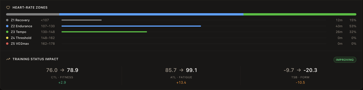
Heart-rate zones and training status impact
The zone bar shows where you spent your time, with each zone’s target range and the actual minutes and percent next to it. For a cycling session you get the same view for power. The colours match the zones across the app, so a green-heavy bar reads as tempo at a glance and a yellow-heavy bar reads as threshold.
The training status impact card sits right below. It shows your CTL, ATL and TSB before and after this session, with the delta below each one. A small green pill on the right calls out the new training status based on TSB: detraining above +20, fresh between +5 and +20, maintaining between -10 and +5, improving between -30 and -10, and overreaching below -30. Useful when you want to know if today’s session pushed you into productive overload or just into the red.
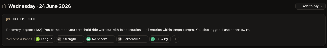
Coach’s note, habits and weight
At the top of every day sits a one-paragraph note from your AI coach. It reads the same recovery score, scheduled session and recorded activity you see, and writes a short, plain-English summary: how recovered you are, how the planned workout went, whether you added an unplanned session, and what that means going into tomorrow.
Below the note you log your habits and wellness for the day with a single tap: fatigue, soreness, mood, strength, mobility, your own custom habits like "no snacks" or "screentime", plus your weight. Streaks are tracked, the values flow into the recovery and analytics views, and the AI coach can reference any of them.
Built for cyclists and runners
Cycling
Running
Why the LeCoach day view is different
A coaching dashboard, not a feed and not a spreadsheet.
One place for everything
Honest, banded signals
Coach one click away
Frequently asked questions
See your training day, end to end
14-day free trial. No credit card. Cycling, running, walks, hikes and races, all in one view.